Brand Identity Design: Elements, Steps and Examples
Brand identity design explained: what it includes, the elements to design, a step-by-step process, and how to apply it consistently on your website and print.
Brand identity design is the work of turning what your business stands for into a consistent set of visuals and words: a logo, colors, typography, imagery, voice and the rules for using them. Done well, it makes your business recognizable at a glance and credible on first contact, whether someone finds you on Google, on a truck door or on a business card. This guide covers what brand identity design includes, how it differs from visual identity, a practical process you can follow, and how to carry it onto your website.
TL;DR
- Brand identity design covers both the visual side (logo, color, type, imagery) and the non-visual side (mission, values, voice, customer experience).
- Visual identity is one part of brand identity, not a synonym for it.
- A workable process runs in order: define the brand, study competitors, set strategy, design the visuals, document the rules, then apply them everywhere.
- A style guide is what keeps your identity consistent on your website, email, social profiles and print.
- Your website is where identity and lead generation meet, so design them together.
Table of Contents
- What brand identity design actually is
- Why brand identity matters to your business and your website
- The elements of a brand identity
- A step-by-step process for designing a brand identity
- Applying your identity consistently
- Examples of brand identity in practice
- Our perspective: identity is a lead generation tool
- Getting help with your identity and website
- FAQ
- Sources
What brand identity design actually is
Brand identity design is the visual and conceptual representation of a business, as Adobe’s guide to the topic puts it. The “conceptual” half matters. A logo without a clear idea behind it is decoration. A clear idea without a consistent look is easy to forget.
The discipline reaches beyond the visuals. According to Linearity’s overview, brand identity design includes visual identity and marketing materials, plus nonvisual elements such as messaging and the quality of customer service. Mailchimp describes brand identity as the complete package of who a company is: its mission, values, voice, customer experience, personality, positioning and communication style.
For a local service business, that translates into something very practical. Your identity is what a homeowner sees on your site, hears on the phone, reads in your estimate and notices on your van. If those five things feel like five different companies, trust drops before you have said a word about price.
Brand identity vs. visual brand identity design
People search for both phrases, and they overlap. The difference is scope.
- Visual identity is the collection of graphics, colors, typography and design elements that create a brand’s look, per Mailchimp.
- Brand identity is broader. It includes the visual identity and also what the business stands for.
A useful way to hold it: visual identity is how you look, brand identity is who you are and how you behave, and the visual identity is its most visible expression. Linearity also notes that brand identity design is related to corporate design, the visual design applied to internal and external business materials, but the two are not 100% the same.
If you are hiring for a logo and business cards, you are buying visual identity. If you are also deciding what you promise customers and how you sound, you are doing brand identity. Most small businesses need both, in that order of priority: decide who you are, then design how that looks.
Why brand identity matters to your business and your website
A clear identity does three jobs for a business that depends on local leads.
- It makes you recognizable. Repeated, consistent visuals are what people remember when they need you six months later.
- It shapes how you are judged. Harvard Business School Online quotes Avery comparing brand identity to tinted glasses: it colors how consumers understand, experience and value a product or service, and helps build the emotional connections that influence buying decisions.
- It supports conversion. Shopify’s guidance on website branding says strong branding can increase recognition, reach your target audience, lift traffic, guide visitors toward conversion and build loyalty.
That third point is where most small business owners see the payoff. A site with a mismatched logo, stock photos that do not look like your crew, and three different button colors reads as unfinished. Visitors hesitate, and hesitation is the enemy of a form submission or a phone call. We cover the cost side of this in our look at whether a professionally designed website is worth it.
The elements of a brand identity
Shopify lists the core parts of a brand identity as a logo, color scheme, typography, voice and tone, packaging for physical products, and imagery, with imagery covering photography, iconography and illustration. Adobe adds the intangible assets: company values, mission, personality, tone of voice, culture and the emotions people associate with you.
Here is how each one works in practice for a small business.
| Element | What it covers | A decision to make |
|---|---|---|
| Logo | Primary mark, simplified version, icon-only version | Does it stay legible on a business card, a favicon and a truck? |
| Color | Primary, secondary and neutral colors with exact values | Which one color will your buttons and calls to action always use? |
| Typography | One heading font, one body font, size rules | Is it readable on a phone in sunlight? |
| Imagery | Photography, icons, illustration style | Will you use real photos of your team and work? |
| Voice and tone | Word choices, level of formality, what you never say | Do you sound like a neighbor, an engineer or a corporation? |
| Print and packaging | Business cards, invoices, uniforms, vehicle graphics | Does every piece carry the same logo and colors? |
| Values and positioning | Mission, promise, who you serve and why you are different | Can you say it in one sentence? |
Notice that only the first five rows are things a designer draws. The last two are decisions you make, and they steer every drawing decision.
The five P’s, and why we treat them as a checklist
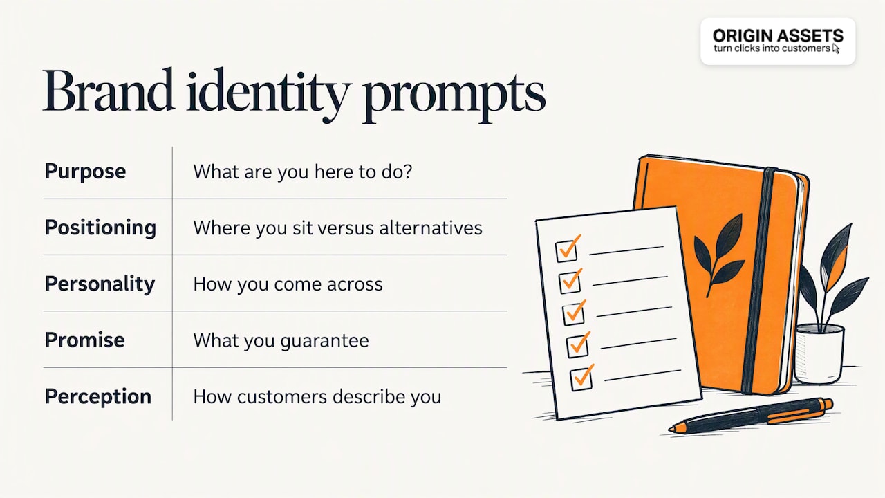
Readers often ask about the “5 P’s of brand identity.” There is no single official list. One frequently used version covers purpose, positioning, personality, promise and perception. Treat it as a set of prompts rather than a standard: what are you here to do, where do you sit versus alternatives, how do you come across, what do you guarantee, and how do customers actually describe you. If you cannot answer the first four, no logo will answer them for you.

A step-by-step process for designing a brand identity
This sequence follows the process described in Adobe’s guide, adapted for a business owner commissioning the work.
- Define the brand. Write down your mission, values, history and where you want the business to be in three years. If you hire a designer, expect them to interview you on exactly these points.
- Study your competitors. Look at how other businesses in your market present themselves. The goal is not to copy them. It is to find the visual and verbal territory nobody is using, so you can stand apart.
- Set the brand strategy. Decide your positioning, personality and messaging. This is the brief the designer works from.
- Design the visual elements. Logo, colors, typography and imagery come next, chosen to match the personality you defined.
- Document the rules. Put everything in a brand style guide so anyone can apply it correctly.
- Apply it everywhere. Website, email signature, social profiles, business cards, invoices, proposals, vehicles.
- Review it once a year. Check that real-world use still matches the guide and that the identity still reflects what the business has become.
The common mistake is jumping to step 4. A logo drawn before step 3 is a guess, and guesses get redrawn, which costs more than doing the thinking first.
How long each stage tends to deserve
There is no universal timeline, but the proportions are consistent. Strategy and documentation are the stages owners most often shortchange, and they are the ones that make the visuals last. If your budget is tight, simplify the visuals (one logo, two colors, two fonts) rather than skipping the strategy and the style guide.
Applying your identity consistently
Designing the identity is half the job. The other half is using it the same way for years.
A brand style guide is the rulebook for everything a brand designs and creates, from font choices to logo treatments, according to Adobe Express. HubSpot’s guidance for startups recommends a style guide for visual standards and voice, applied through website copy, imagery, UX/UI and functionality, with consistent branding across email, social media, websites and storefronts.
Stanford’s marketing primer makes a point worth remembering: logos and icons are only a few components of visual identity, and an effective brand needs a defined but adaptable visual system that works across packaging, retail, advertising and websites. NielsenIQ frames the same idea as consistency and flexibility: coherent across online and offline media, yet able to adapt as markets and audiences change.
What a useful one-page style guide contains
You do not need a 60-page document. A small business can get most of the value from one page:
- Logo versions, minimum size and clear space, plus two or three “never do this” examples
- Color values (HEX for screens, and print values for cards and signs)
- Heading and body fonts, with sizes for web
- Photo guidance: real work and real people, plus what to avoid
- Three voice rules with a before-and-after sentence for each
- The exact wording of your one-line description and your primary call to action
Adobe’s examples include a fictional garden nursery guide, a designer’s IKEA refresh and the Real Alloy guide, which shows appropriate imagery and what not to do with its logo. The “what not to do” page is the most practical part for a small team.
Your website is the busiest touchpoint
For most local businesses, the site is where identity gets tested. Check these on every page:
- The logo is the current version and links home.
- One accent color is reserved for calls to action.
- Headlines and body copy follow the voice rules.
- Photos show your real team, trucks or completed jobs where possible.
- Contact details and your description match your business profiles and print materials word for word.
That last point also helps local search. When your name, description and branding are the same everywhere, customers and search engines see one credible business instead of several near matches. If you are updating your look, our guide to web design trends that help small businesses stand out shows how to modernize without losing recognizability.
Examples of brand identity in practice
Large brands make the principles easy to see. Mailchimp uses McDonald’s golden arches, classic M and yellow-and-red colors as examples of visual identity elements: a few simple, repeated signals that you can recognize from a distance.
The lesson for a local business is scale, not imitation. You do not need a global campaign. You need one logo that holds up small, one color people associate with you, and the discipline to use them on the van, the website and the invoice alike. A plumber whose truck, site and estimate all share the same blue and the same plain-spoken voice is building identity just as surely as a national chain.
Our perspective: identity is a lead generation tool
We see brand identity from the website side. Over a decade of building sites for local businesses, the pattern we see is that owners treat branding and lead generation as separate projects, a logo here and a website there, and then wonder why visitors do not call.
Our view is that identity should be designed to convert. That means a few concrete things:
- Decide the one thing you want a visitor to do and give it one consistent color and one consistent label across the site.
- Write the voice rules before the copy. Persuasive copy only works if it sounds like the same business on every page.
- Keep the system small. One logo, two fonts, a short palette. A small system is easier to apply correctly, and correct application is what builds credibility.
- Use authentic imagery. Real photos of your team and work beat generic stock for trust, and they are impossible for a competitor to copy.
- Treat the style guide as a working tool, not a deliverable that sits in a folder. If your office manager and your web designer cannot both apply it, simplify it.
An identity that looks good but does not drive inquiries has not finished its job. We would rather build one that earns its place on your website.
— Rafael
Getting help with your identity and website
If you want the identity and the website built to work together, we handle both. Our services include logo design, business cards and graphic design alongside website design, local SEO and automated lead generation, so your visuals and your lead flow come from one plan. Our website packages are published at $197 per month for Starter, $397 per month for Momentum and $447 per month for Accelerate. A setup fee applies, and its amount is not published, so ask us for it when you request a quote.

If your site needs ongoing care once the identity is in place, our website management and maintenance service keeps pages, branding and content consistent over time.
FAQ
What is brand identity design?
It is the process of defining and designing how a business presents itself. It combines visual parts such as the logo, colors, typography and imagery with non-visual parts such as mission, values, voice and customer experience. The aim is a consistent, recognizable and trustworthy impression everywhere customers meet you.
What are the steps to creating a brand identity?
Start by defining the brand, then study competitors and set a strategy covering positioning, personality and messaging. After that, design the visual elements, document them in a style guide, and apply them across your website and print. Review the identity annually.
What is the difference between branding, brand identity and visual identity?
Branding is the overall practice of shaping how people perceive your business. Brand identity is the set of elements you control to do that, including values and voice. Visual identity is the visual subset: logo, color, type and imagery.
Do I need a style guide if I am a small business?
Yes, but a short one. A single page with logo rules, colors, fonts, photo guidance and voice rules is enough to keep your website, cards and social profiles consistent when more than one person touches them.
Where should I start if I only have a small budget?
Do the thinking first: write your mission, who you serve and your voice. Then keep the visuals simple, with one clear logo, a short palette and two fonts. A clean, consistent system beats an elaborate one applied unevenly.
Sources
- The Complete Guide to Brand Identity Design (Adobe)
- What’s brand identity design? (Linearity)
- Visual Identity Guide: Build a Strong Brand (Mailchimp)
- What Is Brand Identity? Tips & Examples for Shaping Yours (Harvard Business School Online)
- 6 Key Website Branding Elements for Online Stores (Shopify)
- What Is Brand Identity? 6 Key Elements (Shopify)
- What is Brand Identity? Design Guide (Adobe UK)
- How to create a style guide and 3 top examples (Adobe Express)
- Branding for Startups: Brand Identity and Website Conversion (HubSpot)
- Brand marketing primer (Stanford GSB)
- Brand identity: how to create a brand identity (NielsenIQ)
Recommended
Share this article

Written by : Rafael
Follow us
A quick overview of the topics covered in this article.
Latest articles
November 8, 2026
November 8, 2026